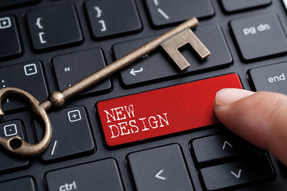
I’ve been dropping hints here and there that I’ve wrapped up the new LifeDev theme, and as you can see… things look a bit different 🙂
So. Whatcha think?
I’m still working out some kinks here and there, and if you see anything out of whack, do let me know either in the comments of this post or the contact form. Please excuse the dust as we settle in to the new digs. Oh, and make yourself at home.
Special Thanks
A couple people were absolutely instrumental in me finishing this theme, and I’d be quite ungrateful if I didn’t point them out to you.
- Cath Duncan – A cheeky lady who has no problem telling me that a) I’m a dork and b) when a design doesn’t work.
- Charlie Gilkey – Charlie was my “nagger”, and I mean that in the best way possible. He emailed me, DM’d me and kept me accountable throughout the whole process. What a champ. I hereby dub Charlie as “Mr. Follow-up”.
Jonathan Fields and Karl Staib also gave me some great input as well. Thanks guys!
Major Changes
So if you’re a design geek and what to know what’s different under the hood.
1. Custom Theme
Yup, I designed this baby all by myself. No more stock theme (as some have complained about in the past). I probably went through four revisions before I settled on the theme that I liked.
I built the theme on the excellent Thesis framework. It’s my first real attempt at customizing a framework as opposed to a theme, and I’d highly recommend it. It has a bit of a learning curve, but once you get it down, there are plenty of benefits to the theme.
This theme is tons leaner, and is supported by all browsers except IE6. If you’re still running IE 6, you’ll notice that lots of sites don’t look so hot either. You really should upgrade if at all possible.
2. Introducing @font-face
I’ve been itching to try some new font-faces. Typically people design sites with just a handful of fonts that are “browser safe”. Now that font-face has become mainstream (Google just entered the the game), it’s a lot easier to create pages with unique fonts.
Without going too crazy, I used three:
- Marketing Script – for the curly navigation links and various other headers
- Latin Modern Sans – for most of the headings in the articles and the sidebar
- Droid Sans – the default text across the site
So far I really like the new fonts. I think they add a little sizzle that’s harder to get with just the standard ‘ol fonts.
3. New Identity
While the other theme was easy and cheap free, it didn’t really give any indication of who I really am. I’m a playful, gregarious, “swarthy” (thanks Cath) guy. This theme I think does a pretty good job of reflecting that. The other theme said I was “easy and cheap”. Not the best endorsement, huh?
Things to come
There are a couple things that I might add in the near future to the blog.
Video
I’d like to start getting into posting the occasional video here and there. If anything just to test it with you guys and see if it’s something that’s valuable. If not, I’ll scrap it.
I’ve seen more and more bloggers start posting videos on their sites, and I love it. It adds personality and creates a connection that straight text just can’t provide. So we’ll see.
Newsletter
This is a big maybe. I mean, you can always get these posts delivered in your email, but I’m talking about a private, non-on-the-blog type of thing. Dunno. Still on the fence on this one.
So there we are. I’d love any comments on the new theme below.
Oh, and thanks again for being here.


